01 / OVERVIEW
Brand Foundation
The brand book, made interactive.
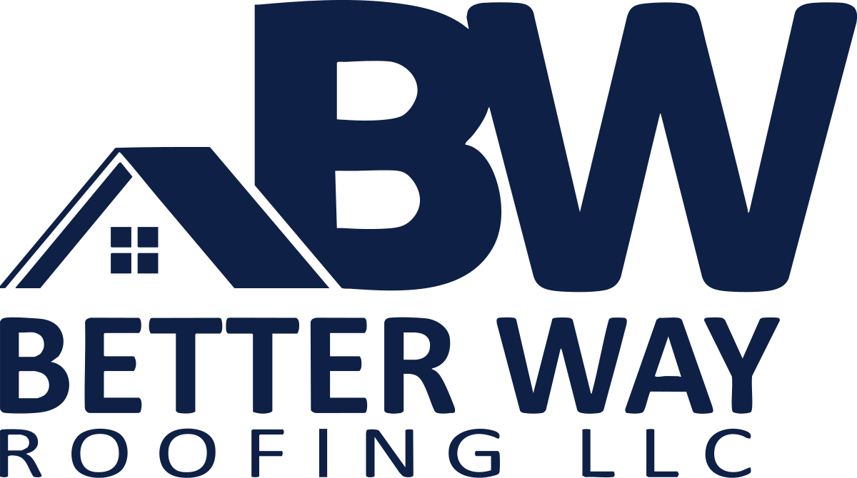
Better Way Roofing.
Building better lives through better roofs.
The brand book, made interactive.
Better Way Roofing builds and protects homes across Northern Indiana and Southern Michigan. The brand has to feel the way the work feels: precise, honest, neighborly. This kit shows the parts and the rules so any project, sign, or post stays on brand.
Brand Identity
Core Values
- 1.Better Way, Always
- 2.Measure Twice
- 3.Do the Right Thing. Period.
- 4.All In, Every Day
- 5.Humbly Confident
Primary Color
Better Way Navy
#0F2046
Heading Font
Asap
Body Font
Asap
Brand Values
Plain-spoken. Honest. Local. Warm.
02 / LOGOS
Logo System
Three approved variants. Use the right one for the right surface.
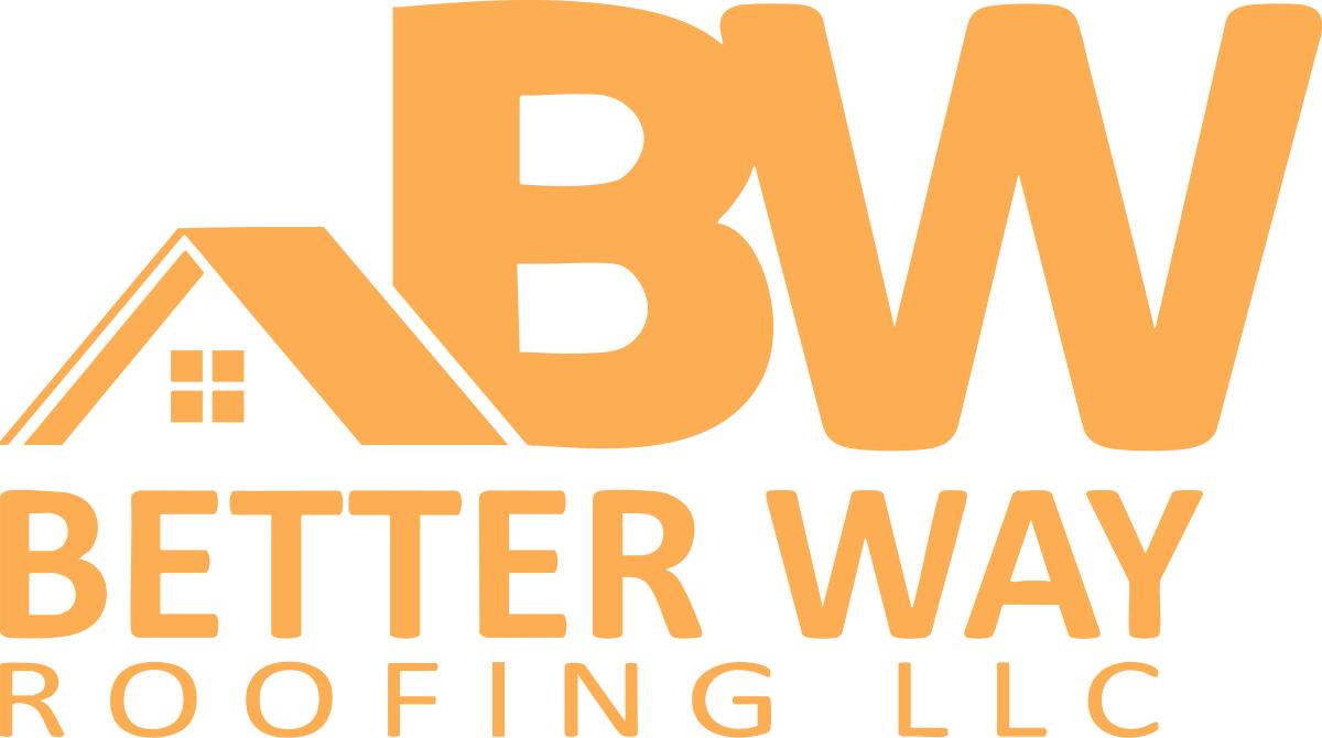
Logo on Brand Backgrounds
See the navy logo on each brand color. Pick a variant that holds contrast.
03 / CORE PALETTE
Primary Colors
The three colors that carry every Better Way layout.
Better Way Navy
Primary#0F2046
RGB 15, 32, 70
CMYK 88, 75, 23, 65
The foundation. Logo color, headers, primary backgrounds.
Amber
Primary#FDAE53
RGB 253, 174, 83
CMYK 0, 36, 76, 0
The spark. Buttons, highlights, callouts.
White
Primary#FFFFFF
RGB 255, 255, 255
CMYK 0, 0, 0, 0
Negative space. Backgrounds, breathing room.
Amber tints and shades
Navy tints and shades
04 / SECONDARY PALETTE
Supporting Colors
Use these to add structure and texture without stealing focus.
Deep Rust
Secondary#AA431B
RGB 170, 67, 27
CMYK 20, 80, 100, 30
Pairs with Amber for gradients, hover states.
Sky Blue
Secondary#688FBA
RGB 104, 143, 186
CMYK 53, 27, 8, 0
Tags, badges, secondary highlights.
UI Gray
Secondary#CACFD4
RGB 202, 207, 212
Borders, dividers, table lines.
Charcoal
Secondary#494849
RGB 73, 72, 73
Body copy on light backgrounds. Use instead of pure black.
05 / PAIRINGS
Color Pairings
What works together. What doesn't. Contrast scored against WCAG 2.1.
Approved
Navy / White
#0F2046 on #FFFFFF
White / Navy
#FFFFFF on #0F2046
Navy / Amber
#0F2046 on #FDAE53
White / Charcoal
#FFFFFF on #494849
Off-white / Navy
#F8F9FA on #0F2046
Soft Amber / Deep Rust
#FDE7CC on #AA431B
Avoid
Amber / White
#FDAE53 on #FFFFFF
Sky Blue / White
#688FBA on #FFFFFF
UI Gray / White
#CACFD4 on #FFFFFF
Amber / Sky Blue
#FDAE53 on #688FBA
06 / 60 / 30 / 10
Color Ratio
The split that keeps every Better Way layout grounded and on brand.
Navy and white
The foundation. Backgrounds, body copy, structural elements.
Sky Blue, Charcoal, UI Gray
Supporting structure, sections, dividers.
Amber and Deep Rust
Highlights, calls to action, the moments that earn attention.
07 / OPACITY
Opacity Scale
Five steps for every brand color. Used on backgrounds and shapes only.
Never apply opacity to type.
Navy
#0F2046
Amber
#FDAE53
Deep Rust
#AA431B
Sky Blue
#688FBA
Charcoal
#494849
08 / GRADIENTS
Gradients
Six gradients, each with a distinct job. Don't invent new ones on the fly.
Sunrise
Hero CTAs, buttons on dark backgrounds.
Sundown
Animated buttons, premium accents.
Horizon
Section dividers, large background fills.
Slate
Footer washes, dark mode panels.
Whisper
Card backgrounds, subtle depth.
Flame
Headers on dark backgrounds.
09 / TYPOGRAPHY
Type System
One typeface, three weights. Discipline is the design.
Heading
Asap
Weights: Bold (700), SemiBold (600), Regular (400)
Usage: Display, section titles, callouts.
Case: Title Case for headlines. ALL CAPS for short labels only, with +30 tracking.
Tracking: Tight on display, normal on H1, +30 on ALL CAPS labels.
Body
Asap
Weights: Regular (400), SemiBold (600)
Usage: Paragraphs, captions, UI labels, fine print.
Case: Sentence case. Left-aligned. Never centered for long copy.
Tracking: Default. Never letter-space body type.
| Style | Example | Size | Weight | Usage |
|---|---|---|---|---|
| Display | Built better. | 40-72pt | Bold | Hero headlines, cover pages. One per page max. |
| H1 | Section title | 24-32pt | Bold | Major section titles. With amber underline. |
| H2 | SECTION DIVIDER | 12-14pt | Bold ALL CAPS, +30 tracking | Section dividers within page. |
| H3 | Inline heading | 11-13pt | SemiBold | Inline section headings. |
| Subheading | Subheading line | 14-16pt | SemiBold | Above body content for emphasis. |
| Body | Default paragraph copy. Line height 1.4 to 1.5. | 10-12pt | Regular | Default paragraphs. |
| Caption | Captions, fine print, footnotes. | 8-9pt | Regular | Captions and fine print. |
10 / DON'TS
What Not To Do
The brand only works when these rules hold.
These are not suggestions. The brand only works when these rules hold.
Logo
Stretched logo
Do not stretch, squish, or skew the logo.
Logo
Wrong color logo
Do not recolor outside the three approved variants.
Logo
Drop shadow on logo
No shadows, glows, strokes, or outlines.
Logo
Logo on busy photo
Always use a solid background plate.
Logo
Rotated logo
Never rotate the logo.
Logo
BW separated from wordmark
Do not break the primary lockup.
Type
Wrong font
Do not mix Asap with other typefaces.
Type
ALL CAPS body copy
Reserved for short subheads only.
Voice
Em dashes
Use commas, periods, or "to" instead.
Voice
AI-sounding language
No "leverage," "holistic," "optimize," "solutions provider," "best-in-class."
Imagery
Stock photos
Only real job sites, real crew, real customers.
Layout
Centered body copy
Body copy is left-aligned.
11 / IN CONTEXT
The Brand, Applied
Live UI samples. Buttons, cards, signs, social. The brand at work.
Buttons
Business Card
Lyle Lehman
Visionary, Better Way Roofing
(574) 370-8342 | betterwayroofing.com
Yard Sign
Building better lives through better roofs.
(574) 370-8342
Email Signature
Lyle Lehman
Visionary, Better Way Roofing
(574) 370-8342 | betterwayroofing.com
Building better lives through better roofs.
Social Post
When you choose
Better Way,
you choose better.
12 / TOKENS & CODE
Design Tokens
Drop-in code for any project. CSS variables, Tailwind theme, or JSON tokens.
:root {
  --bwr-navy:        #0F2046;
  --bwr-amber:       #FDAE53;
  --bwr-rust:        #AA431B;
  --bwr-blue:        #688FBA;
  --bwr-gray:        #CACFD4;
  --bwr-charcoal:    #494849;
  --bwr-offwhite:    #F8F9FA;
  --bwr-soft-amber:  #FDE7CC;
  --bwr-font:        'Asap', system-ui, -apple-system, sans-serif;
}